As a UX designer, I have a plethora of tools I can utilize to help me improve a products’ or services’ user experience. User journey and user flow happen to be two tools I like to use to help me find where I can improve the users’ experience. As similar as they are, there are very distinct differences.
Similarities
 From both these tools, we can observe and analyze user behaviors. Both user journey and user flow are created with the users destination in mind. Either of these tools will reveal any possible complications that a user might have as they attempt to get to where they want to go. This information is important because it will help designers design and plan the next steps in the journey and flow and they have the user in mind.
Differences
 User flow is what most people will assume you are talking about when you bring up either tools. But the main objective of a user flow is to illustrate the possible paths a user may take to get to the destination they are targeting. This is usually depicted with screens interlinked with routes leading to an eventual end point.

How does a user flow benefit the design process? Well, firstly, it’s a visual representation of how a user would navigate a website or mobile application. This is helpful because you and your designers can see clearly what the user is going to see as they make their way through your product.

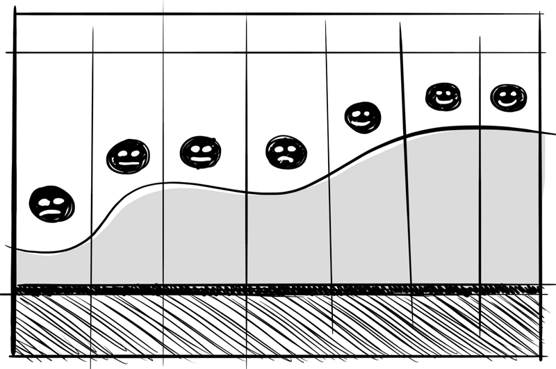
User journey requires taking a step back and observing the behaviors of the user before, during and after their interaction with the product. The steps in a user journey are usually identified as scenarios and touch points, not necessarily a web page or screen. This includes any motivators and triggers that the user may have come across, as well as how that touch point made them feel at the moment.
Example
Let’s consider a mobile app that hails a cab for you. The users’ objective is to successfully hale a cab to pick you up from your location and deliver you to your desired destination. A user flow would usually start with the users home screen, then the applications launch screen, and maybe a map screen asking for an address of the destination that the user is trying to get to. Ultimately, the user flow would end when the user reaches their destination. There might be an extra screen that confirms the completion of the cab fare.
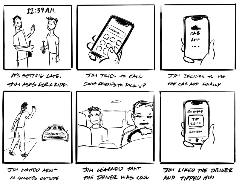
 A user journey, however, would consider the users motivation to use the application. This is when a scenario would be helpful. A sample scenario could be: the user is looking for a ride home after a late night at a party where he has been indulging in alcohol. The first touch point of the journey could be him realizing the time and asking his friends for a ride home only to be turned down because none of them drove themselves or were not able to legally drive on their own either. The next touch point could be the user calling other friends in the area for a ride home out of desperation.
As a user experience designer, we consider these touch points so that we can make note of what state of mind the user might be in, if they are happy or sad. His next steps might then be to open the cab service app. This is where user journey and user flow have some overlap. The following steps will seem similar, but the purpose of each tool is different.
The user flow would be more specific about the path a user takes through the process of the task of calling a cab, as the user journey is mindful of the state of mind of the user, understanding if they are enjoying their process or if there is any discomfort to address.

To further depict the situation, storyboards can be used with the user journey to illustrate the touchpoint of the user.


