Giving Access to Accessibility
Project Overview
Apartment hunting can be fun, but as a person with very specific needs, it can be difficult to find something that would qualify being a place you can call home.
While the government has plans to increase affordable housing by building more housing units to accommodate demands, it will be a while before we see these units. So until then, people need a way to browse for homes, especially in the more “affordable” bracket.
Challenge: Enhance the credibility and usability of Socialserve.com by improving accessibility and general aesthetic of their website.
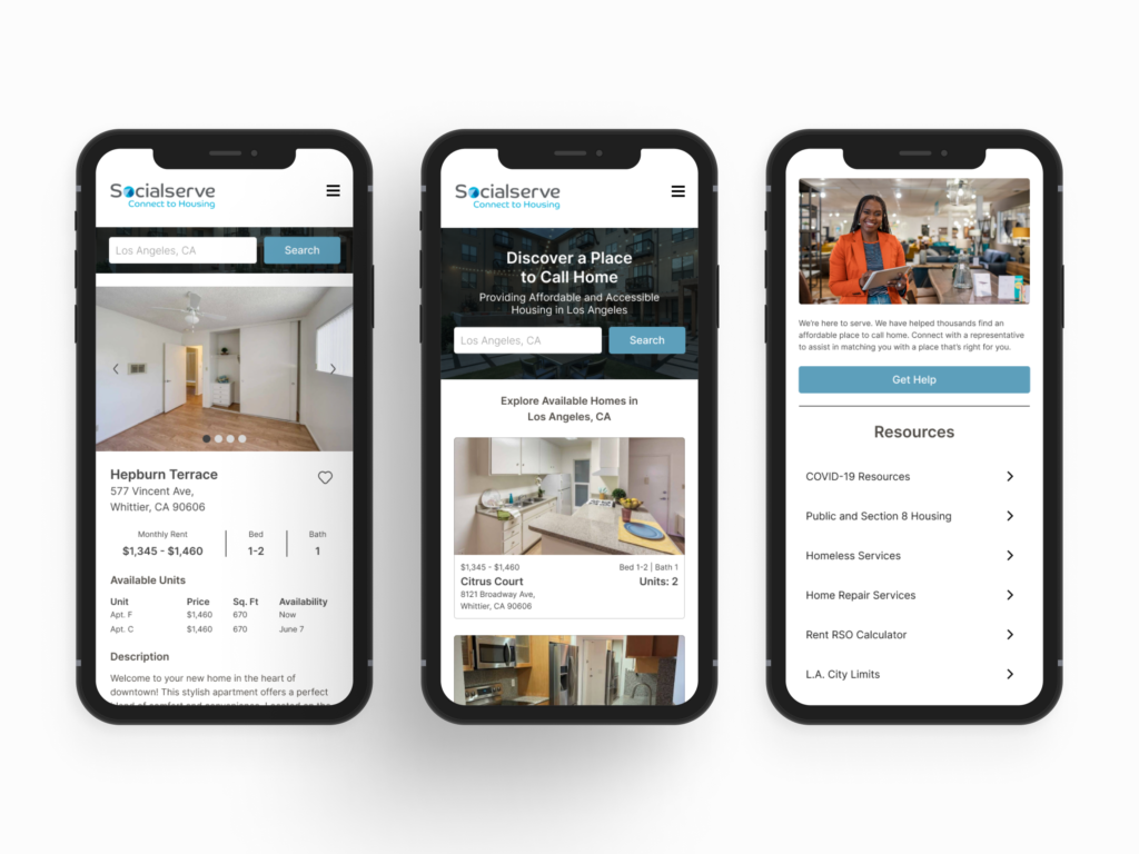
Outcome: A responsive mobile web experience that include useful features for finding affordable housing.
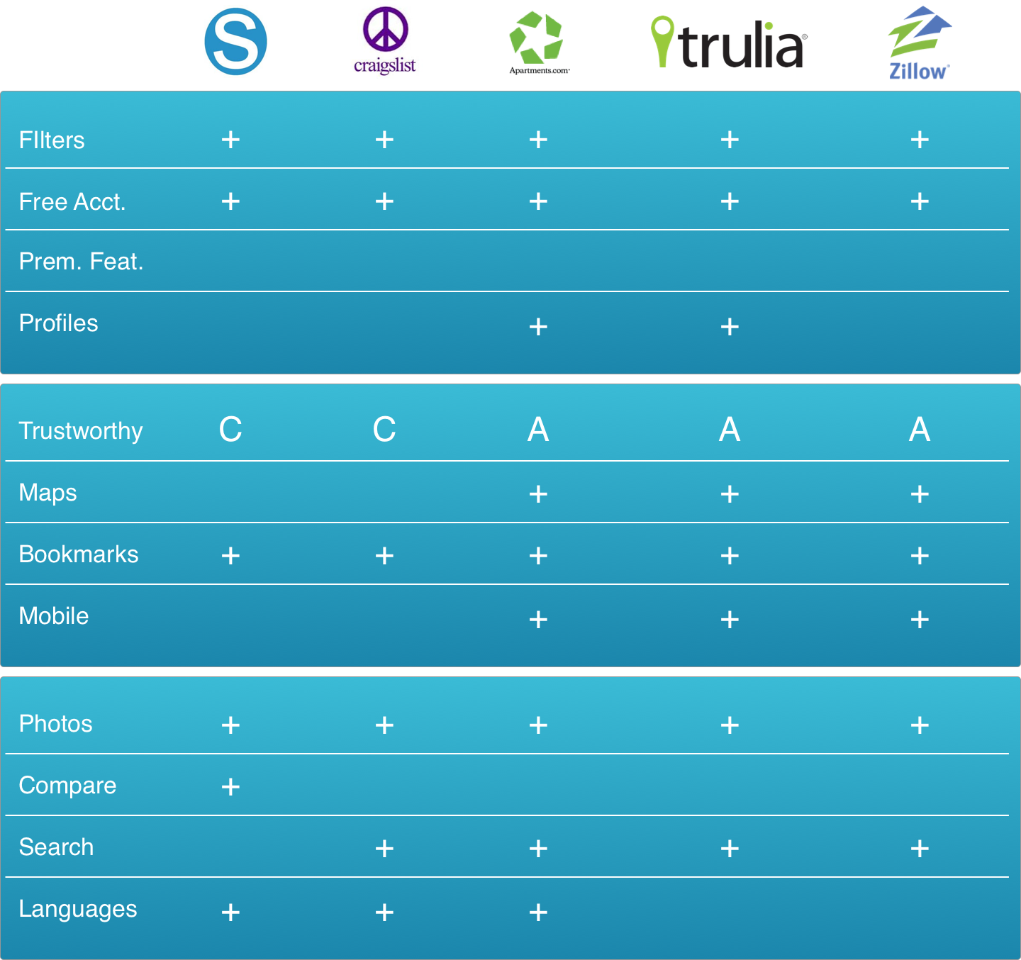
Research: Recruited user interviews and testing through Craigslist, Facebook, Linkedin. Competitive analysis through desk research of existing customers reviews.
Prototyping: Figma, Sketch, Balsamiq
UX Tools: Affinity mapping, Empathy mapping, Journey Mapping
Duration: 4 weeks
I created a prototype of a responsive mobile website informed by research of low-income individuals seeking housing assistance. Using this prototype, I conducted moderated usability tests to gain deeper insights into user requirements, aiming to enhance the usability and desirability of Socialserve.com.
Our Approach of Discovery
We began with competitive analysis, extensive secondary research, and gleaned insight from on our own personal experience looking for an apartment.
There are many competitors available to help find a place to stay, but most home shopping seemed to be a privilege for the affluent. For low-income families, housing is scarce and difficult to afford without government aid.
Who Needs Socialserve.com?
- Low-income families
- People with disabilities and strict requirements of living

Finding affordable housing is difficult in major cities, such as L.A. All our interviewees were spending more than 40% of their monthly income on rent. Though price is a major constraint for users, there was an issue we noticed that was being overlooked – accommodations for those who need accessibilty.
What We Wanted to know
We inteviewed nine people to learn about their attitudes and behaviors around their experience shopping for a new home and more importantly it made them feel.
- How are you currently finding housing?
- This gave us an opportunity to discover competitors or alternative methods of searching for housing that we weren’t already aware of.
- What is the most difficult part of finding a place?
- This helped us hone into the pain points and frustrations around finding a place.
- And some questions about their personal situations of why they are or have started searching for a new place.
- We wanted to hear about their motivations and gain some context as to what deciding factors needed to be considered.
How They Currently Find Homes
As we assumed, most people mentioned popular platforms such as Craigslist and Apartments.com. When asked if they were aware of sites and services like socialserve.com we observed
Some of our participants mentioned they have considered applying for government assistance when looking for a new place. But in their response, they displayed indefference about them. When asked why they felt that way, they commented on how tedious it was to even begin the process of using those services to find a home.
Features of Socialserve.com stacked up competitively, but it lacked usability. Many functions were hard to find because of the poor level of visual clarity.
Pain Points and Frustrations
The issues that we have come to recognize through user interviews are as follows:
- Tracking Progress – It was easy to lose track of the progress of applications, how many applications have been submitted, who was the contact, the details about the property, etc.
- Accommodations – As a person with special needs, it was really difficult to find a place with the level of accomodations they wanted.
- Barriers – Finding a place through government assistance was a big hurdle to get over. Most report that the applicaiton process was a gate that kept them from even browsing potential homes.
What Users Want
Our interviews revealed to us how readily they had their ideal home in mind.
- Price – A place that they can afford within a certain price
- Location – Close proximity to where they work
- Safety – Quality of their neighborhood
Though our interviewees expressed their ideal living conditions, there was an apparent need – a way to find it.
Hurry Up and Wait
As we found in some statements in our interviews, the process of searching for low-income homes through government assistance left much to be desired.
One of our interviewees said that the process of applying for assistance felt like a hasty process done out of desperation only to end up having to join a waitlist with no promise of qualifying. “Hurry up and wait,” as they put it.
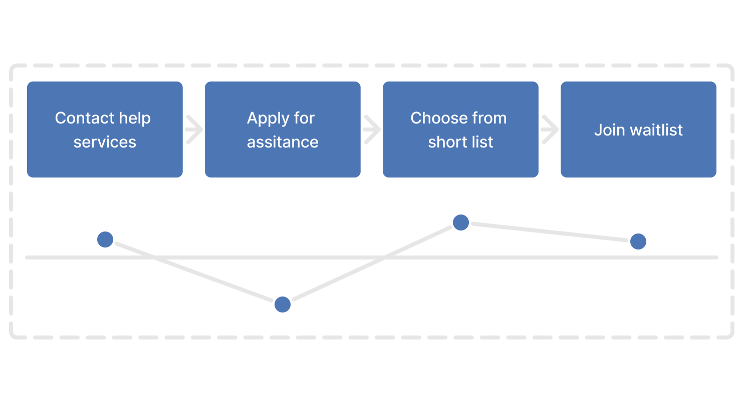
When we analyzed the task, browsing rentals was allowed only after the application process was complete. This stalled the excitement of seeking their potential new homes.
The biggest point of friction was the application process.
And to dampen their moods, most places required joining a waitlist, adding even more time to finding a place ot move into. “Hurry up and wait.” was how one of our participants described it.
Choosing Which Problem To Solve
People who are struggling financially or with other special requirements need a more inclusive way to find a new place that accommodates them because they want to be able to shop like others do.
So how might we make shopping on socialserve.com less taxing for someone who is already struggling?
Hypothesis
Allowing users to browse for potential homes first and then apply for qualification would sustain the positive experience longer. When renters find a property they’re interested in, they begin the application process, motivated by their potential new home.
To simplify communication between renters and property managers, we considered implementing a user profile feature in Socialserve. The information renters use to apply would be saved and used for future applications, eliminating the need to repetitively input their personal information.

Focusing on the MVP
We prioritized navigation and findability, aiming to create a housing search tool with a diverse range of listings. Our goal is to provide an enjoyable shopping experience on Socialserve.com, while also offering users a way to determine if they qualify for government assistance.
Early Stage Experimentation and Testing
We wanted to see if rearranging the flow of the task to find an apartment on socialserve.com would improve engagement. So we mocked up a few quick lo-fi paper prototype frames and put them in front of a few people to see if they understood the flow and concept.
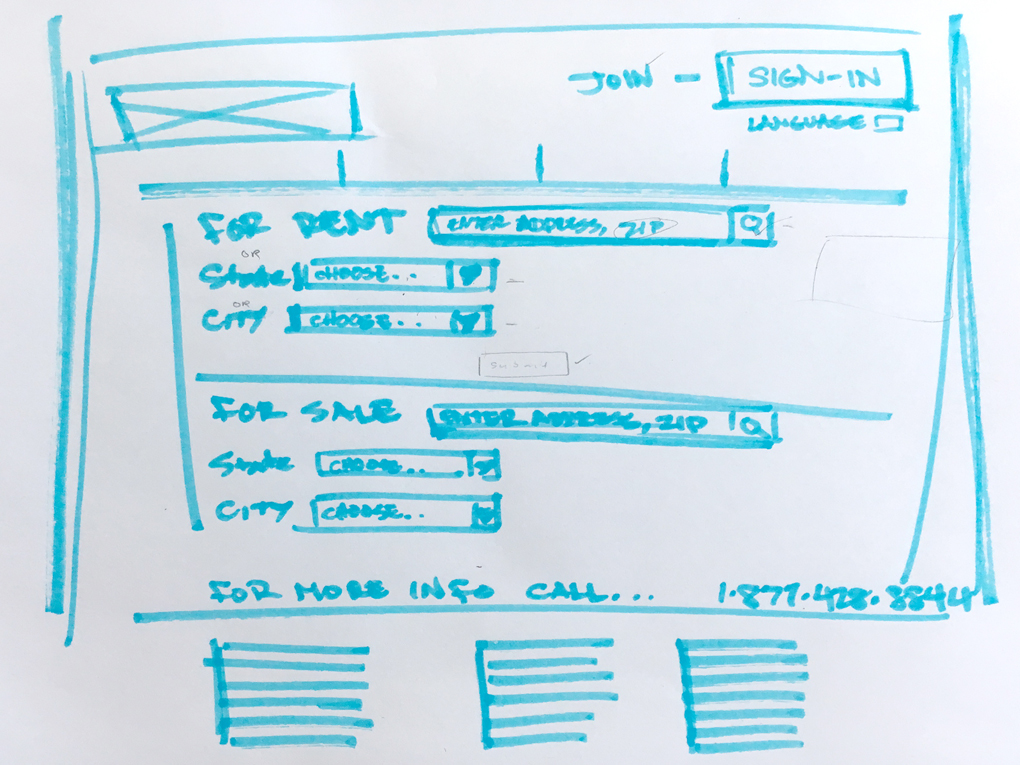
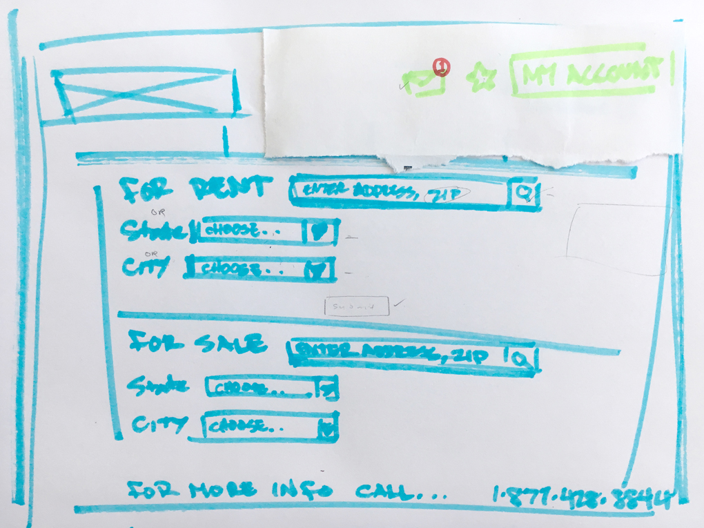
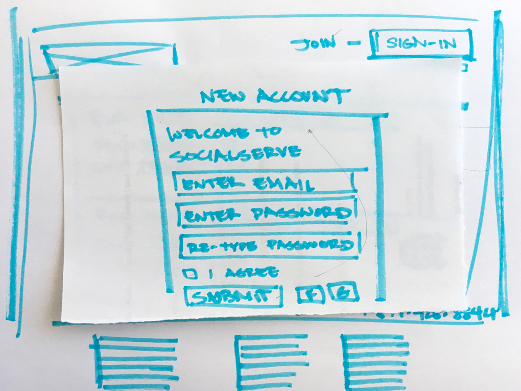
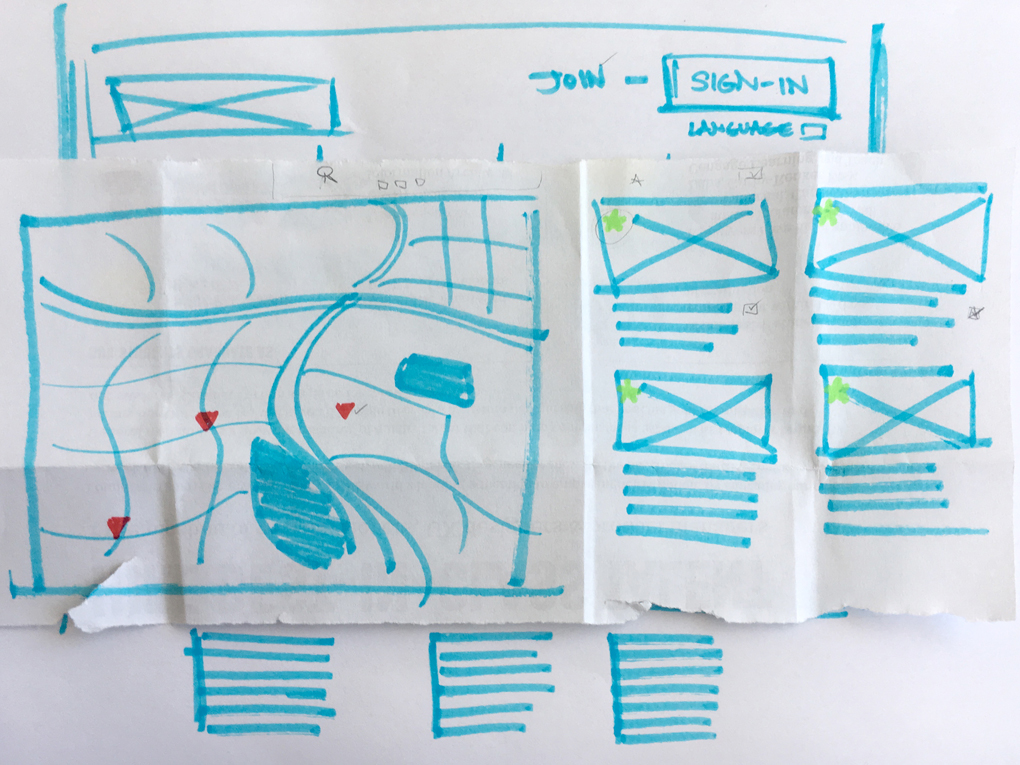
We compared our findings to our initial task analysis and decided to move forward to build something we could observe user interactions. So we used Balsamiq to build a low fidelity digital prototype to watch how people would interact with our redesign.
Usability Test Planning
Task: “Find a place you’d consider calling your new home using this website.”
Scenario: “imagine they helping their family member who was confined to a wheelchair living on disability.“
Our goal or testing was simple. We wanted to observe whether our redesign allowed users to intuitively use the tools we designed for them.
Screening for Testers
For our research, we targeted a specific group of people by reaching out to friends who met these criteria. We posted a public screener survey in our network seeking individuals who are:
- Currently looking for housing or have recently moved
- Earn under $40k per household annually
- Working or job hunting in the city
Back to the Drawing Board
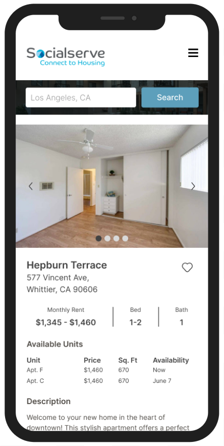
In our next iteration, we applied our findings toward designing a responsive mobile version that we’d use to conduct further tests.
The decision to create a mobile version was informed by learning that more people browse using their smartphones than a desktop computers.
Make it Familiar
When shoppers find a property of interest, they can explore its dedicated page for more detailed information.
We adopted design patterns similar to our competitors to provide users with a familiar and intuitive shopping experience.
The user account would allow them to favorite these apartments and track the progress of their application.
Tools For Those Who Need It
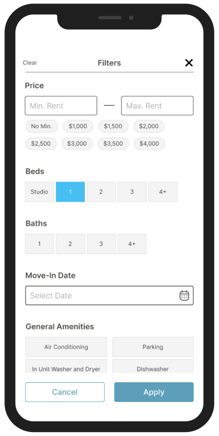
To enhance the shopping experience, we implemented tools such as:
- Price range filter
- Move-in date picker
- Robust list of ameneties
This allowed shoppers to customize their search criteria easily and find products that fit their specific needs.
Make Getting Help More Findable
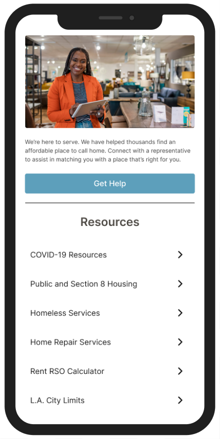
If users need help getting started with the application process, they can get in touch with someone directly from the front page.
Or utlize the “Resources” section to get quick answers to questions they might have.


Redesign
After a few rounds of moderated usability tests with our lo-fi prototypes, I took our findings and created a high fidelity mockup to represent those changes we’d make.
In addition to stronger affordances, clearer labeling and a more organized sitemap, I included more useful options to filter through.
Next Steps
Our research revealed that individuals in need of low-income housing often require assistance in other related areas, such as employment and health. So if further development were to be done for this project, we would consider designing access to these broader needs as well.
While we addressed the usability issues of the original website, we discovered that usability was not the primary concern for making Socialserve truly effective for its target demographic.
