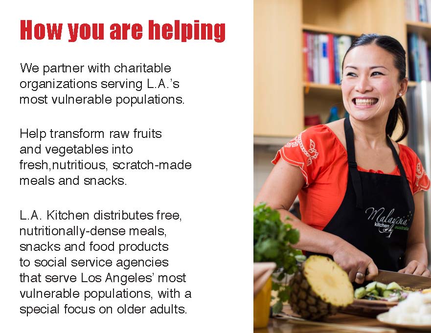
L.A. Kitchen is an organization based in Los Angeles that believes “neither food nor people should ever go to waste.” So they set themselves ahead of the problem they try to solve by reclaiming food healthy food and training previously unemployed candidates for positions they offer in the kitchen. The program we addressed in this project was the Impact program that invites volunteers to their kitchen. The volunteers are instructed by the trained staff in how to process fruits and vegetables that would be used in snacks and meals to be donated later. This is all done in the efforts to reduce food waste as well as give back to the community.
As popular as the program is, L.A. Kitchen faces the challenge of keeping volunteers engaged during their time in the kitchen, and in turn, convincing volunteers to return and continue to contribute. So we ask the question:
To read more in detail about the process of this project, you can refer to this post.
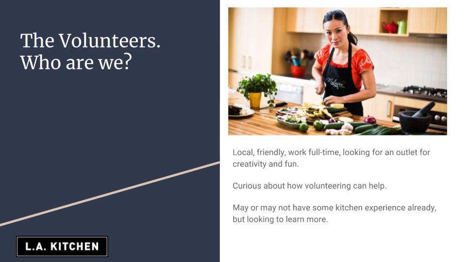
Let’s introduce the user. Volunteers can come from all sorts of backgrounds. In our persona, we wanted to represent the general interests of the volunteers. For the most part, we found that most the volunteers were locals, who have lived in the surrounding areas for a while. Most have not heard of L.A. Kitchen and wanted to learn more on how they could help the cause. But not everyone has had any proper kitchen training.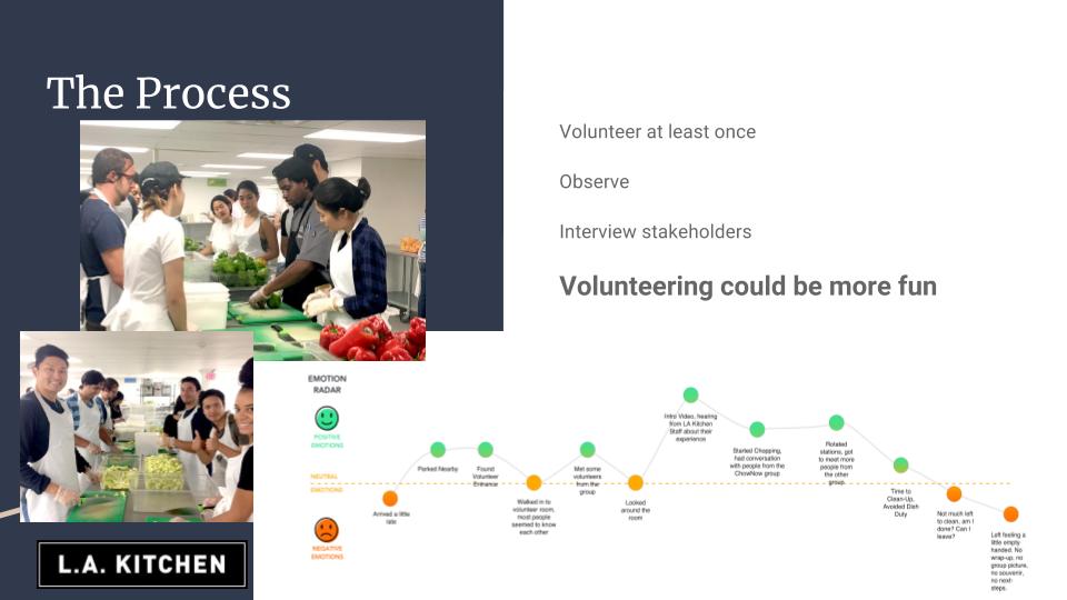
As part of our research, we spent at least one day volunteering in the kitchen and learning what a volunteer experiences throughout their time their. From the beginning of our on boarding experience to the end of the day when we finally tear our disposable aprons off, we made note of all the ups and downs that we across as a volunteer. The empathy map among some of the volunteers we interviewed seemed similar. But it was agreed that the end of the experience was the least satisfying.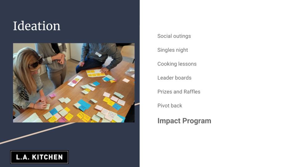
We spent a day coming up with ideas that could possibly make the experience better. Ideas like singles night, cooking lessons, prizes and raffles come up. We evening came up with a fun, elaborate way to gamify the experience with a leader board where volunteers can compete against each other. But in the end realized that all these ideas seem to be more distraction from the tasks that were given us as volunteers. So we pivoted back and brought the attention back to the main objectives of the Impact program.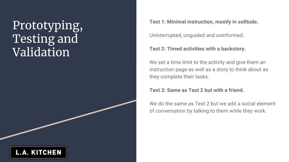
We came up with this simple idea that would not only bring the volunteer to concentrate on their task, but also entertain them slightly.
Hypothesis: By giving the volunteer parameters such as a time limit and schedule, they will be less reluctant to perform.
We came up with 3 variations of the test so that we can observe the differences in the testers behaviors. The tasks were simple: tear a sheet of paper into small squares, and then create small paper balls with another sheet of paper. Our prototype was a sheet of paper with a crude illustration of what we wanted them to do. One instruction sheet had small squares to illustrate the size and shape of the squares we wanted. The other sheet has small circles to illustrate how small we wanted the paper balls. Underneath each of the illustrations, we included a short reason for what they were doing.
“This confetti will be used to celebrate at parties all over L.A. this new years eve.”
“These paper balls will be used as ammunition in next week’s spitball fight.”
The first test was to ask the volunteer to complete a task without much instruction. They were asked to complete the task alone without any interruption. We asked them to let us know when they think they were done. We would then ask them to complete another task.
In the second task, we gave them a set time (1 minute per task) to complete the task. We also gave them notice that there would be another task immediately after. In addition to this, we gave them the instruction sheet.
The third test was similar to the second test, but we introduced the addition of another volunteer to take part. This was meant to simulate a group setting.
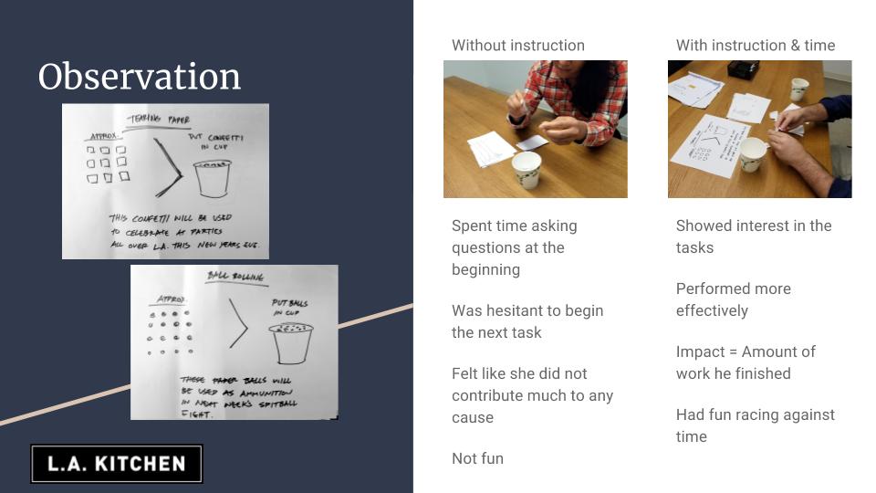
What we observed was that without clear, informative instruction, the volunteer was spending more time asking questions and sometimes seemed frustrated or unsure of his/her performance. When instructed to continue onto a second task, they hesitated and reluctantly agreed. In the end, we found that they didn’t enjoy the activity and felt like her efforts were wasted.
In the following tests, we found that not only did the time limit give them a sense of accomplishment, it made the experience more enjoyable. We learned that the time limit gave the volunteer a reference of their progress. They were able to gauge themselves and even made up their own goals to complete during its duration. And when asked to go onto the next task, there were eager to take the “challenge.” During each task, we observed that they would refer to the instruction sheets periodically during the minute to read.
At the end of the test we found an interesting bit of behavior. When asked if they felt like they contributed much to the “cause,” the volunteer actually compared their results to the illustration to make sure that their work was at some sort of level of “acceptability.” We think the presence of the instruction sheet was endearing and met our goal to create a way to keep the volunteer engaged.
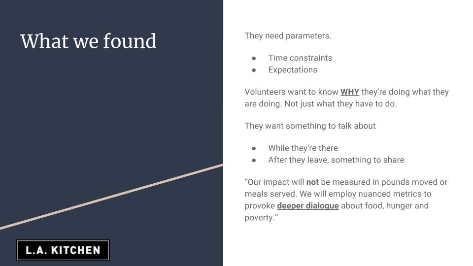
So what we took away from our findings during the test was that the time constraints were helpful to distract from the mundane tasks. We gave them information about what they were going to do and for how long they would be doing it for, preventing any type of disappointment or sense of inconvenience. But most importantly, we gave them a reason for what they were doing.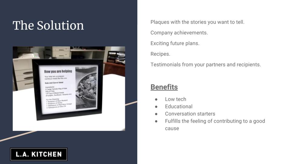
We mocked this plaque to mimic what it would be like to have that type of information present while performing tasks.
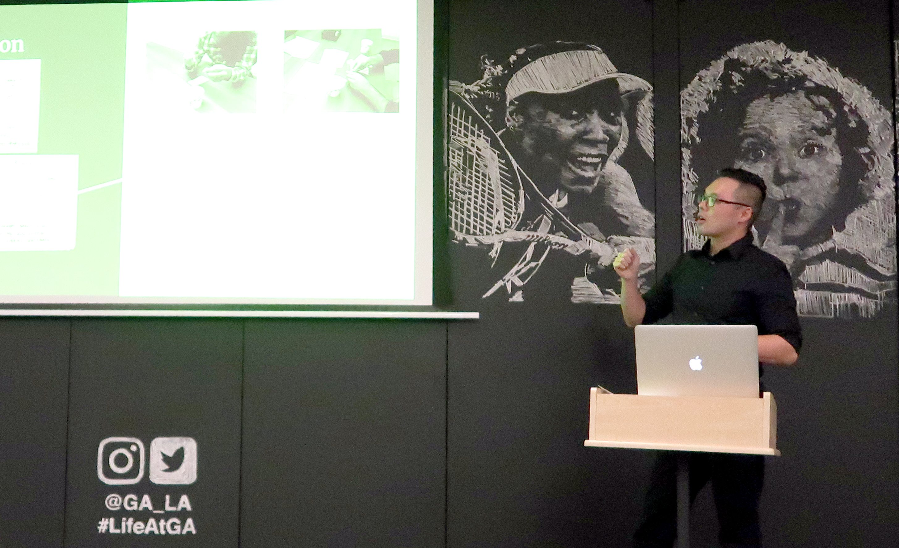
What we concluded was that, as a volunteer, we want to have fun and learn. The less it seemed like work or an inconvenience, the more fun we could have. What the plaque could provide would be bits of interesting facts of L.A. Kitchen, to educate the volunteer about the cause, give them something to talk about while they were surrounded by like-minded volunteers, conversation starters. At the end of the day, when we pull our hairnets off and toss our aprons in the trash bin, we could leave knowing what it was we contributed to and feel good about it, even share the story with our friends.
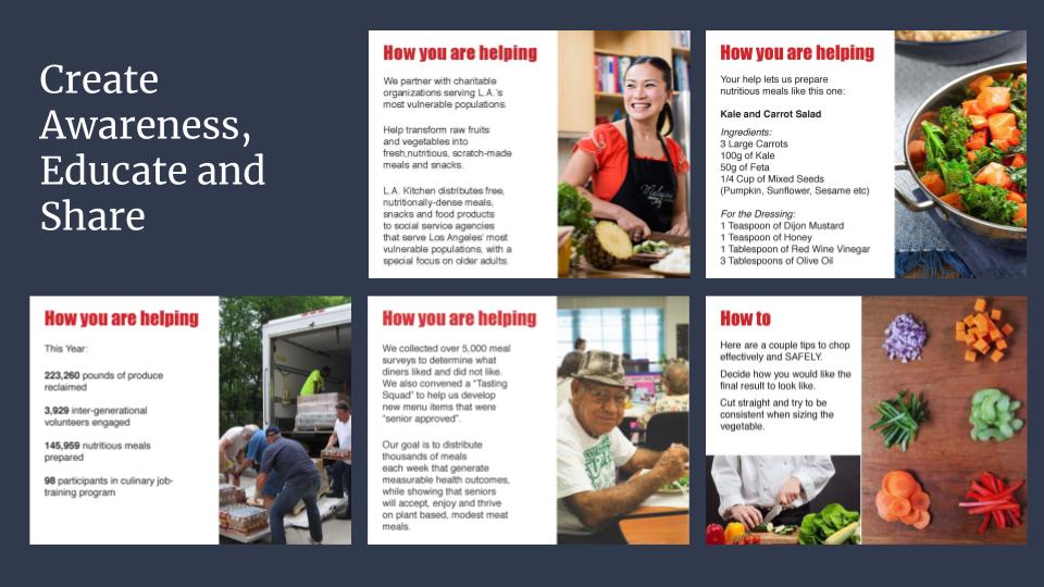
 Next steps would be to gather more information about L.A. Kitchen and compile it all into a data base we could use as marketing and resources to create more fun and interesting plaques.
