What is a storyboard?
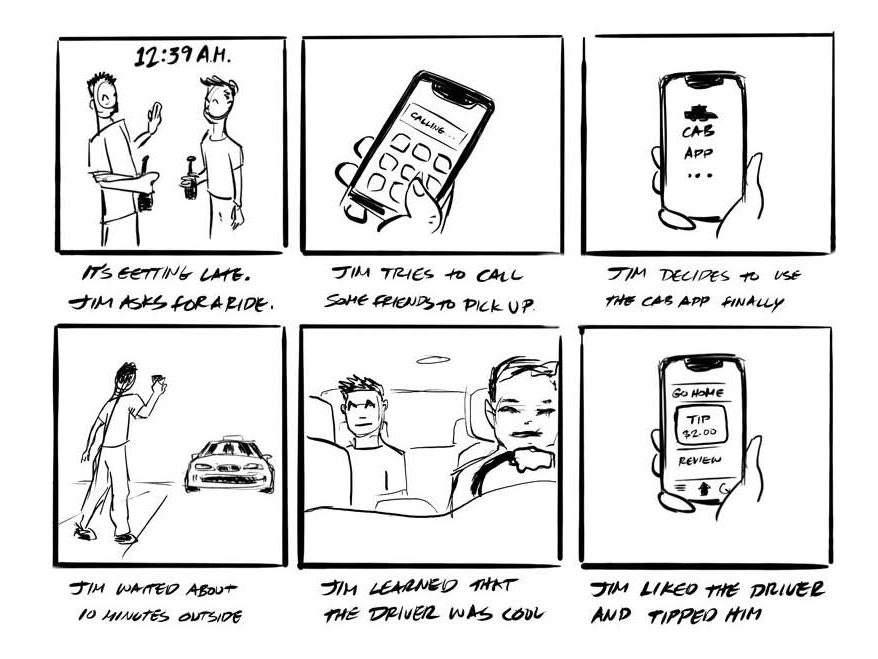
By definition, “a storyboard is a linear sequence of illustrations arrayed together to visualize a story. Designers use this to think through the user’s journey from beginning to end.”
In the case of UX design, the story should revolve around a problem a person (user) is facing, or a solution they are using. And most importantly, how they feel when they come across these issues.
The beginning of their journey should take place before they come across the user’s issue to give the story some context and end after their encounter.
Why use a storyboard?
A storyboard can help depict actions that are hard to describe. Imagery tends to be more universally understood than written text and lets your audience grasp concepts easily.
For example, if you were to describe a tool you use to pound nails into hard surfaces (a hammer), it might sound something like, “it’s a heavy object on the end of a stick that you swing at nails to push them into wood,” or something to that effect.
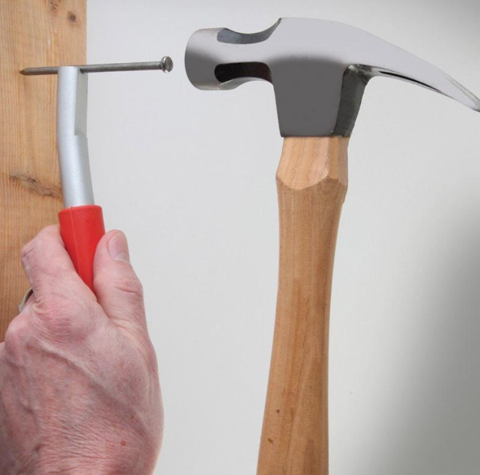
Using an image to show people what you are describing is much easier to produce and understand.
In the UX field, it’s important to understand where your users are and what they are interacting with in order to gain more empathy for them. Depicting the user in a scene gives designers and other members of the design process the ability to connect with users in their environment and think more holistically about their problems.
As you can see in the example, not only is it necessary to hold the nail, but it may sometimes be necessary to hold it horizontally. This circumstance may not be apparent without having had seen it demonstrated in an illustration.
So what does a storyboard need?
My basic format goes something like this:
1. Characters – who is the main character/user?
2. Plot – what will the journey look like? Include a place and time as well as the situation they’ll be experiencing.
3. Emotion – how do they feel as they interact with or experience?
You’ll need a main character, also known as your user, to base the story around. The point of this is so that you can describe how your user is responding to their situation.
It helps to determine the place and time the experience is taking place. The scenario should illustrate a situation in which your subject is experiencing a problem or using a solution. This gives more insight to how the user might be feeling and shine light on other possibilities that can take place at that moment.
Emotions play a crucial part of storyboarding. Which makes it another important piece of information to include in your storyboards. A story without emotions will be bland and doesn’t say anything about how your user is feeling. These emotions could be depicted in your illustrations or described in captions.
TIP: When creating your storyboards, picture the beginning and end of your story first, then fill in the rest. This will help you determine the outcome up front and also the cause for the user’s journey. Everything in between should be realistic and only important details that moves the story forward.
Do you need to know how to draw to create a storyboard?
Yes, but not really. All you really need is an elementary level of skill to help tell your story. Here are some examples (taken from Creative Confidence by David Kelley):
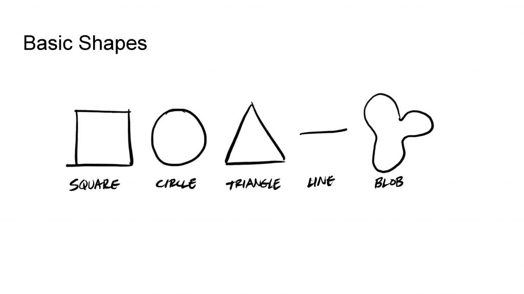
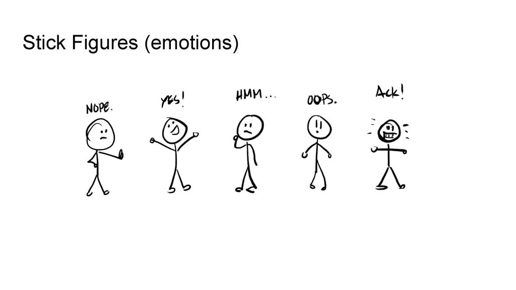
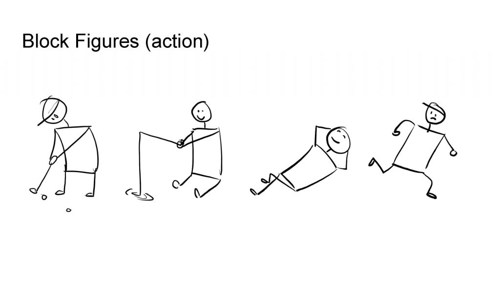
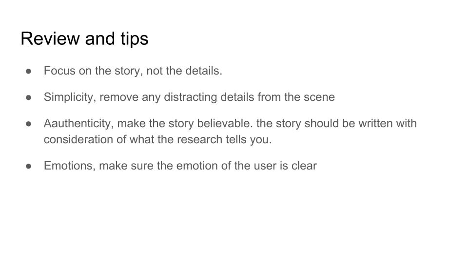
MORE TIPS: Focus on the story, less on the details. Keep it simple, don’t include any details that aren’t necessary to tell your story. Make the story believable by using information you gathered from research. Don’t forget to include emotions of your characters to help tell your story.
Final Thoughts
Storyboarding is a great tool to help designers validate their designs by attaching a realistic reason for their designs to exists. Showing how their design fits in people’s lives gives their work value and can also reveal opportunities that might not have been so apparent.
